Chhh, chhh, chhhanges! This was our theme in December – our website and logo redesign made their grand debut mid-month. You might be asking yourself, what changes did you make and why? Let us take you on the journey…
Website Redesign
As a company we take pride in being Nurse First Focused, having excellent Client Satisfaction and Giving Back to our communities. Therefore, our website needed to exemplify those things! You will find that we incorporated a modern look on an “easy to navigate” platform. Our visitors will find a live job board, simplified application, Nurse First blog and the ability to access the website from any device. We laid out the website with healthcare professionals’ best interests in mind. You have enough stress, navigating a website or completing an application shouldn’t be one of them!
Since healthcare professionals entrust us with their livelihood, we wanted to bring the human element of our team to life. Developing and nurturing a relationship is a two way street, so you need to know us as much as we need to know you! Phone calls and emails from a “mystery” person is not how we operate. Therefore, you can use the “MENU” on the upper right side of the page to snoop around and learn more about our team, what we do, how we can benefit your career, FAQs… oh and you can check out some of our “on camera” productions!
Logo Refresh
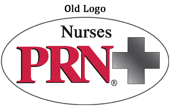
The website redesign also came with a logo refresh – making everything shiny and new! Modernizing the logo came with many meetings and discussions on how we wanted to convey our company’s brand. To give you an idea of the transformation, take a look at the old versus new logos shown below.
From a quick glance, the appearance doesn’t look significantly altered, but the changes made were intentional on how we wanted our brand interpreted. We wanted the word “Nurses” to be the focal point as nurses and healthcare professionals are at the heart of our business. We also modernized it by removing the drop shadow behind PRN, eliminating the gradient fill in the cross symbol and updated the font. Voila! A nice little logo face lift to go with the modernized website redesign.
We hope you can spend some time on our new website checking out the updates and admiring the refreshed logo!
Smile on…
Katie Dietz

